This page introduces the concept of the Splunk AppDynamics Service Performance Overview dashboard. Dashboards are instrumental in monitoring entities as you can view the entities you are interesting in as well as aggregate data, all in one place.
To navigate and view dashboards, from the left side navigation menu:
- Click Dashboards.
- Click Service Performance Overview.
This dashboard has three filters that focuses on the metadata of the selected entity:
- Service
- Instance status
- Service instance
To use the filters, click anywhere on the filter bar and select the appropriate entity name or Select All. Filtering impacts all visualizations that are viewable on each dashboard page.
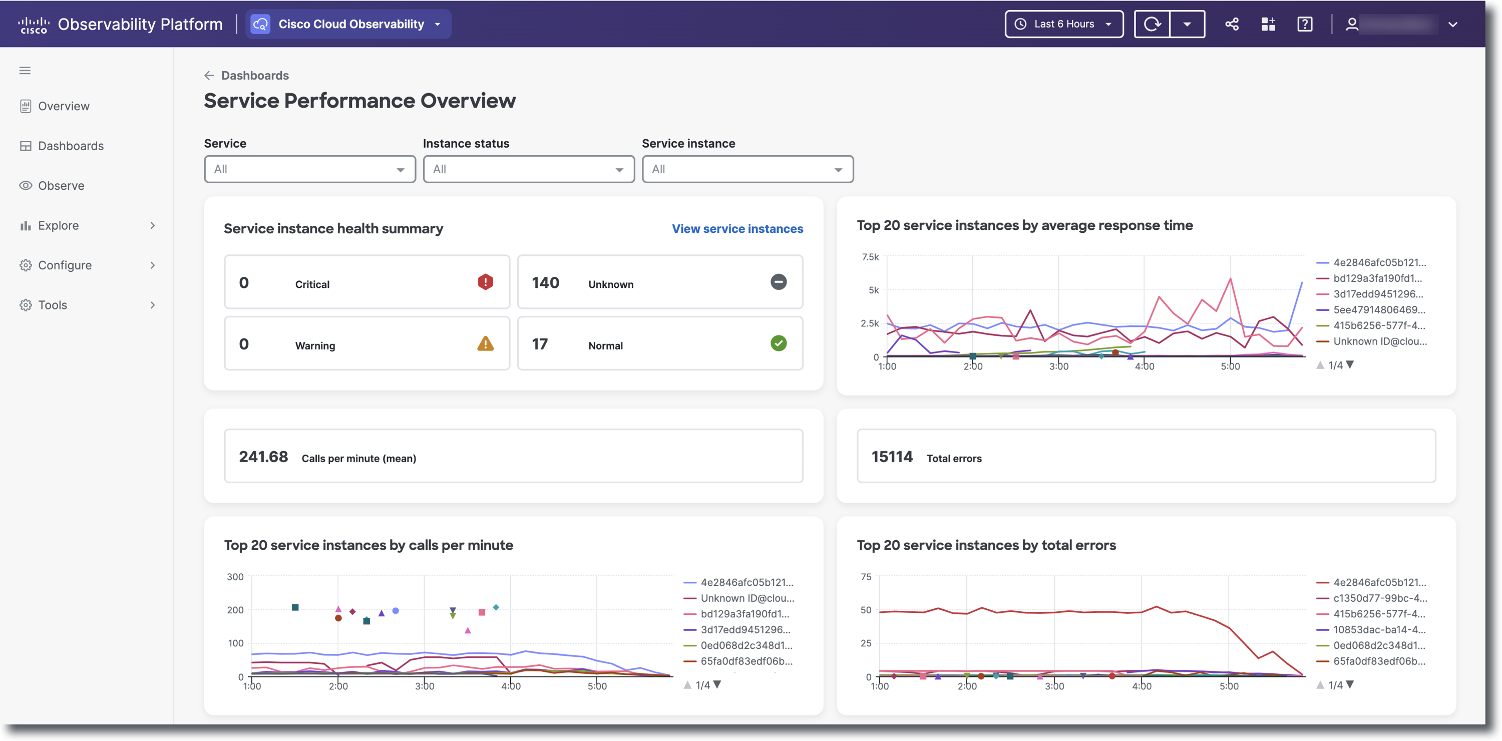
The Service instance health summary allows you to view the health of certain services or service instances. To view all services instances and navigate to the Service Instances list view, in the top right corner of the summary section, click View Service Instances. Calls per minute (mean) and Total errors numbers are displayed as cards.
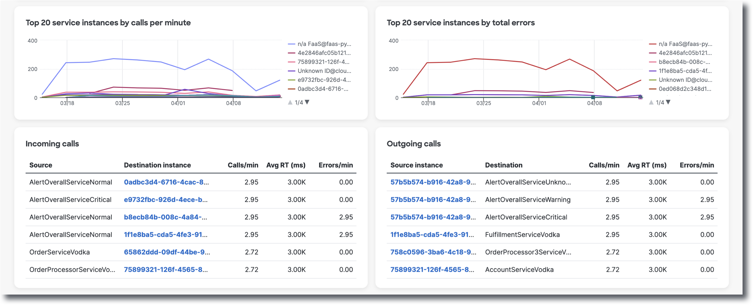
For more in depth metrics such as Top 20 service instances by average time, calls per minute, and total errors, you can view data via line graphs. On the line graphs, click on the legend colored lines to deselect that specific metric. Doing so will remove the line and strike out the metric name that you no longer want to view. To make the data reappear, click on the crossed out service instance name. Hover over a line on the line graph to view a tooltip that displays <service instance ID>@<service name>. The bottom two Incoming and Outgoing calls tables displays the source/source instance, destination/destination instance, calls per minute, average RT (ms), and errors per minute. To navigate to a specific service instance's flow view, click on a specific Destination instance name in the Incoming calls table or Source instance name in the Outgoing calls table.