Download PDF
Download page Troubleshooting Anomalies.
Troubleshooting Anomalies
Related topics:
To demonstrate techniques for using Anomaly Detection and Automated Root Cause Analysis effectively, this example follows an anomaly from the moment it surfaces until its root cause is confirmed. The troubleshooting process can begin with any of the multiple ways to view anomalies. This example assumes that you start with the Alert & Respond > Anomaly Detection page.
Anomaly Detection and Automated Root Cause Analysis are available to SaaS customers only.
Drill Into an Anomaly
- In Alert & Respond > Anomaly Detection, view the Anomalies tab.
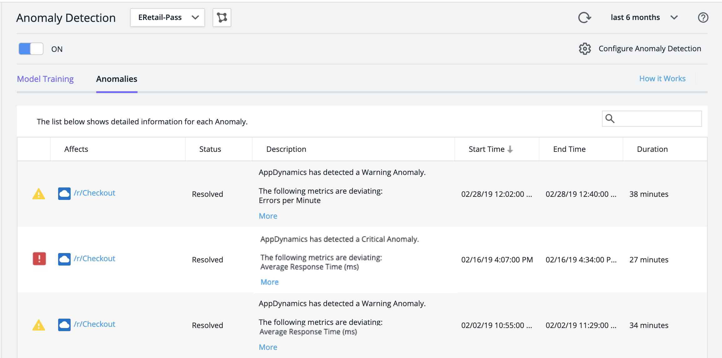
- Double-click an anomaly to open the detailed view.

Initially, the page describes everything that is occurring during the anomaly's Start Time. To review how things change later in the anomaly's lifecycle, click events further along its timeline.
Examine the Anomaly Description
The anomaly description describes the anomaly in relation to its named Business Transaction, the severity level of the selected state transition event, and the top deviating Business Transaction metrics.
In this example, these are:
- Business Transaction:
/r/Checkout - Severity Level: Critical
- Top Deviating Metrics: Average Response Time
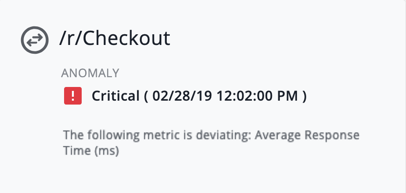
The deviating metric is Average Response Time indicating that checkout responding slowly is the problem.
Examine the Timeline
The state transition events mark the moments when the anomaly moves between Warning and Critical states.
- The timeline in this example begins in the Critical state, followed 30 minutes later by a transition to the Warning state, which lasts only eight minutes.
- Because this simple anomaly starts in the Critical state and remains there for most of its lifecycle, we can probably learn all we need to know from the initial event

By contrast, patterns that appear in more complicated timelines may help you to understand anomalies. For example, this timeline from a different anomaly repeatedly toggles from a brief Warning state to a longer Critical state:
In this case, you should examine several state change events to determine what clues toggling between states offers about problems in your application.
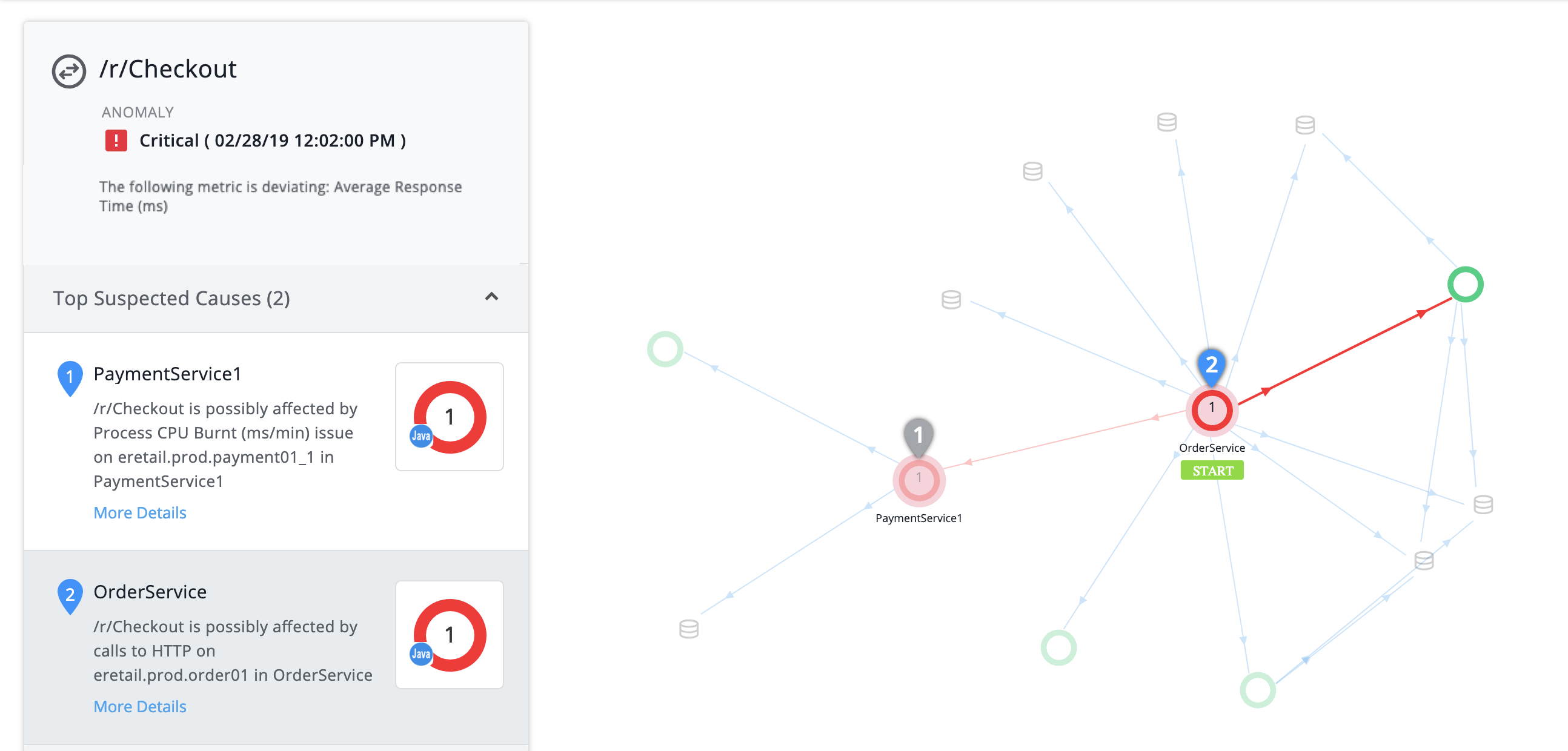
Examine the Flow Map
The example flow map contains:
- The START label shows that the Business Transaction begins with the OrderService tier
- Between the OrderService tier and its numerous dependencies, two tiers are red—these are the tiers where the system has found Suspected Causes

You can now focus on determining which of the red tiers contains the root cause of the anomaly.
Anomaly Detection flow maps are different
There are two types of flow maps in AppDynamics:
- Anomaly Detection and Automated RCA flow map (described on this page)
- Business Transaction flow map
Each of these flow maps detects deviating or unhealthy entities in its own way. Therefore, you will see some differences:
- The two flow maps may show a different health status (as represented by color) for the same entity because each one uses its own algorithm to determine health
- User preferences for positioning or hiding entities saved for the Business Transaction flow map have no effect on the Anomaly Detection flow map
- Some links between tiers might be shown in one type of flow map but hidden in the other
- For example, when no data is flowing through a tier or between tiers:
- Business Transaction flow map may hide them, as 'inactive' tiers or links
- Anomaly Detection flow map may show them in order to represent the application topology completely
- For example, when no data is flowing through a tier or between tiers:
Examine the Top Suspected Causes
The Top Suspected Causes show likely root causes of a Business Transaction performance problem. In this case, we want to know why Checkout is responding slowly.
The first Suspected Cause is a Process CPU Burnt issue on the eretail.prod.payment01_1 node of the PaymentService1 tier:
Hover over the Suspected Cause to highlight the relevant entities in the flow map. Everything but the critical path fades away, revealing that OrderService, where the Business Transaction starts, and which had a degraded response time, relies on PaymentService1:

The second Suspected Cause is an HTTP call on OrderService itself.

Hover to highlight the affected entities:
Which Suspected Cause is the root cause? Which is only a symptom of the overall problem?
- We have a plausible root cause in the Process CPU Burnt issue on PaymentService1 tier, which is ranked likeliest by the system.
- Meanwhile, the HTTP call on OrderService bears some analysis:
- An HTTP call includes both a request and a response
- We know that the tier on the other end, PaymentService1, has its own problem
- Therefore, we can infer that the HTTP response from PaymentService1 is what makes the call slow
Now we see that both Suspected Causes originate with PaymentService1, and the HTTP call issue is really a side-effect of the Process CPU Burnt issue. The system's ranking makes sense.
As we continue to investigate, if we decide that the Process CPU Burn issue is not the root cause, we can reconsider the HTTP call.
There can be anywhere from zero to three Top Suspected Causes. For example, if ART is high but every entity connected with ART is behaving normally, there are zero suspected causes because no suspected cause can be identified.
Drill Into a Suspected Cause
Click More Details for the Suspected Cause to review:
- Simplified timeline
- Metrics graphed over time
Two types of graphed metrics display:
- Top Deviating Metrics for the Business Transaction
- Suspected Cause Metrics
Examine Top Deviating Metrics for the Business Transaction
Deviating Business Transaction metrics can indicate why an anomaly was important enough to surface. (The system does not surface anomalies for every transitory or slight deviation in metrics. Such anomalies would be of dubious value, since their customer impact is minimal. For the same reason, anomalies are surfaced for Business Transactions which have a CPM of under 20.)
Each deviating metric is shown as a thin blue line (the metric's value) against a wide gray band (the metric's Expected Range).
You can:
- Scroll along the graph to compare a metric’s value with its Expected Range at any time point
- Hover over a time point to view the metric's value and Expected Range in numerical form

Hovering to view values in numerical form is essential when the Expected Range is so much smaller than the deviating metric values that the gray band “disappears” into the X axis.
In this example:
- The deviating metric spiked remained elevated for about 30 minutes, then subsided back into Expected Range
- Seven minutes after the metric returned to its Expected Range, the Severity Level changed from Critical to Warning, and eight minutes after that, to Normal
Hovering over time points tells us that for the period of deviation: the Average Response Time was around 1200 ms and above, while its Expected Range was from 370.08 to 721.24 ms
With a key metric elevated by this large amount, it made sense for the system to surface this anomaly.
Because Top Deviating Metrics are at the Business Transaction level, they are the same for all Suspected Causes.
The Top Deviating Metrics timeline also displays the evaluation period of an anomaly in the grey color. The evaluation time period is the duration in which the data is analyzed to detect the anomaly. This timeline helps you to precisely identify the time when the issue started. The following image shows the evaluation period:

Examine Suspected Cause Metrics
You view, scroll through, and hover over Suspected Cause Metrics similar to Top Deviating Metrics.
Top Deviating Metrics describe the Business Transaction, while Suspected Cause Metrics describe tiers or nodes further down in the entity tree. This means that if you have ART as a Top Deviating Metric and as a Suspected Cause Metric, those are two different metrics. Likewise, EPM as a Top Deviating Metric and as a Suspected Cause Metric are also two different metrics.
While the Suspected Cause Metric likely contributes to the way the Top Deviating Metric behaves, the values of the two metrics will differ.
In this example,
- Suspected Cause Metrics are shown for the eretail.prod.payment01_1 node within the ProcessPayment1 tier
- That is the only node the tier has—if the tier had multiple nodes, metrics could be viewed separately for each node
- The pattern of elevation in the Process CPU Burnt and Process CPU Used metrics perfectly matches the pattern we saw in the Business Transaction metrics

The hypothesis is now confirmed:
- CPU usage spiked on ProcessPayment1, a tier that is downstream from the tier where the Business Transaction starts
- This slowed down response time on ProcessPayment1, including its HTTP response to the HTTP request from OrderService
- The slow HTTP call, in turn, slowed response time on OrderService
- Since OrderService is where the Checkout Business Transaction starts, Checkout has a slow response time anomaly
- Since the Process CPU Burn issue on ProcessPayment1 is the Suspected Cause that's deepest in the entity tree, that is the root cause of the anomaly
Results
We used Anomaly Detection and Automated Root Cause Analysis to quickly find the root cause of a Business Transaction performance problem. What kind of time and effort did Anomaly Detection and Automated Root Cause Analysis save us in this case?
Recall that the tier where the Business Transaction started, OrderService, has multiple dependencies including other services and datastores. Anomaly Detection and Automated Root Cause Analysis eliminated (1) all but two tiers as origins of the slow response time on OrderService, and (2) all but the most relevant of the many metrics on those tiers.
You were spared the tedious process of investigating multiple metrics on each dependency in turn. Instead, you confirmed or negated Suspected Causes with a quick glance at timelines, flow maps, and metrics. Anomaly Detection and Automated Root Cause Analysis performed the vast majority of the work in root cause analysis, presenting you with the information you needed to quickly form and verify a hypothesis.
(Optional) Inspect Snapshots and Execute Actions
When you view an anomaly, you can inspect
- Business Transaction snapshots from the time period of the anomaly
- Actions executed as the result of policies you have configured for the Business Transaction
These are options of the standard troubleshooting flow. They are typically done as follow-up.
In this example:
- Suppose we want more context for the Process CPU Burnt issue on PaymentService1. We can view snapshots of transactions affected by that issue. Double-click a snapshot in the list to open it in its own pane, and if desired, drill down into details and call graphs.

- It is common to send messages to a ticketing system when an anomaly occurs. In this case, we posted to Slack, for our Ops team to see that on their phones.
