Download PDF
Download page Dash Studio Widgets.
Dash Studio Widgets
This page provides an overview of existing Dash Studio widgets in AppDynamics. Widgets create a visual representation of your data in the dashboards.
Only certain widgets of Beta Dash Studio have been included on this page. The page will be updated when new widgets release with the product.
Card Component
Cards are small containers for placing the widgets. Cards have a title, border, and sometimes a footer and actions related to the specific context of the Card. These containers have text labels to clearly describe the information. You can rename or delete them.
Grouped Widgets
The widget grouping functionality enables you to organize two or more widgets on a card component or on their respective cards. You can apply widget properties to the entire group of widgets instead of a single widget.
- Each widget is created on a card by default.
- A card component, for a widget or group of widgets, has a title and a background.
Create a Widget Group
To create a group:
- Select two or more widgets.
- Click the group icon
 in the top panel.
Select one of these options:- Group - Groups the widgets on their respective cards.
- Group In Card - Groups the widgets on a card component.
To separate the widgets in a group, click the ungroup icon  in the top panel.
Group Properties
You can apply these properties to modify the appearance of grouped widgets:
| Property | Description |
|---|---|
| Group In Card | Group all the selected widgets on a card. |
| Background Color | Set the background color of the widget. You can either leave the the default option as it is or customize it. |
| Padding | Add extra spaces between the top and bottom of the text within the widget. The default value is 1. |
| Border | Set the border around the widget. |
| Shadow | Set a shadow around the widget. |
| Title | Define a title for the widget. |
| Title Alignment | Align the title of the widget. |
| Title Color | Set the color of the widget title. |
| Subtitle | Define a subtitle for the widget. |
Time Ranges
Global Time Range
The Global Time Range Selector option on the top right enables you to set a time range for the dashboard. This can be for the last five minutes, hours, weeks, or even months.
Widget Time Range
You can compare widgets across different time ranges by setting a time range that is distinct from the global time range.
To set the time range for a single widget independent of other widgets:
- Select the widget to set its time range.
- Go to Widget Properties on the left panel and click Time Settings. Two options display under Widget Time Range: Inherit From Dashboard and Unique To This Widget.
Select Unique To This Widget and set a time range distinct from Global Time Range. Select the Show Time Range toggle to display the time range on the top of the selected widget:
You can enable the Show Time Range toggle for a widget to change its time range in View mode.
Group Time Range
You can set the time range for a set of grouped widgets using the Group Time Range option under Group Properties panel. It provides these options:
- Inherit Time Range - Set the same time range as the global time range for each widget of the group.
- Group Specific Time Range - Set the time range for each widget of the group by selecting an option from the dropdown. You can also click Custom to create a customized time range.
Toggling the Show Time Range option hides or displays the time range in the upper-right corner of each widget in the group.
Simple Navigations
Simple navigation actions in Dash Studio enables basic user interactions and helps you to seamlessly navigate to any specific part of the product. The navigation actions allow you to drill down into complex and detailed information about a selected entity. You can utilize this capability as part of the troubleshooting processes and for root cause analysis.
This feature is available only for Time Series, Pie, Label, Metric Number, and Image widgets.
Navigate with a Single Click
To perform navigation actions with just a click in the view mode, click the widget for which you want to set this action:
- Click Single Click Action option available under the Widget Properties panel.
It displays the following options:- Destination Type - You can select one of the following:
- Metric Browser - This option is selected by default. Click the widget in the view mode to navigate to the selected metric browser.
- URL - Destination Link field displays, where you must enter the desired link. Click the widget in the view mode to navigate to the selected link.
- Dashboard - Dashboard Name field displays when you select this option. Enter the name of an existing dashboard or select an option from the dropdown list. The following option displays if the selected destination dashboard contains variables:
Variable Passing 1 - This option allows you to modify the default value of multiple variables in an existing Dashboard.
For example, if “Dashboard 1” has a variable named “Nodes 1” with value “Node_8000”, you can change the preset value of “Nodes” to any other desired Node value using Variable Passing 1. Similarly you can modify a second variable named “Nodes 2” in the same dashboard using the subsequent field, Variable Passing 2.
Click the widget in the view mode to navigate to the selected dashboard.
- Show In - Select Current page or New Window.
- Destination Type - You can select one of the following:
- Click the View icon at the top right after entering valid details.
In the View mode, click the widget to navigate to the appropriate destination.
Widget Types
These widget types are available in the Dash Studio.
Time Series Widget
A Time Series widget is a two-dimensional time-based series of data points connected by a line. There can be multiple lines on one chart.
Widget Properties
You can select the following options under the Widget Properties panel to modify the visual appearance of the Time Series widget:
| Property | Description |
|---|---|
| Background Color | Set the background color of the widget. You can either leave the the default option as it is or customize it. |
| Padding | Add extra spaces between the top and bottom of the text within the widget. The default value is 1. |
| Border | Set the border around the widget. |
| Shadow | Set a shadow around the widget. |
| Title | Define a title for the widget. |
| Title Alignment | Align the title of the widget. |
| Title Color | Set the color of the widget title. |
| Subtitle | Define a subtitle for the widget. |
| Property | Description |
|---|---|
| Horizontal Axis Title | Set the title of the horizontal axis on the widget. This is optional. |
| Vertical Axis Title | Set the title of the vertical axis on the widget. This is optional. |
| Legend | Set the legend. |
| Legend Placement | Place the legend at the bottom or on the right-side of the widget. |
You can define performance baselines in a widget by adding a Threshold value. You can add multiple thresholds to a widget, which enables you to set threshold values based on the severity.
| Property | Description |
|---|---|
| Label | Set name of the threshold. |
| Value | Set threshold value to be set. |
| Color | Set color of the threshold line. By default, it is black in color. |
See widget time range.
Pie Widget
Pie widget displays single consolidated values for a series of metrics for a given time range as a pie visualization.

Widget Properties
You can select these options under the Widget Properties panel to modify the appearance of the Pie widget:
| Property | Description |
|---|---|
| Background Color | Set the background color of the widget. You can either leave the the default option as it is or customize it. |
| Padding | Add extra spaces between the top and bottom of the text within the widget. The default value is 1. |
| Border | Set the border around the widget. |
| Shadow | Set a shadow around the widget. |
| Title | Define a title for the widget. |
| Title Alignment | Align the title of the widget. |
| Title Color | Set the color of the widget title. |
| Subtitle | Define a subtitle for the widget. |
| Property | Description |
|---|---|
| Data Labels | Define the individual data points that you can turn on or off. |
| Label Format | Set the format of the label. You can select one of the following options:
|
| Value Format | Set the format of the label value. You can select one of the following options:
|
| Legend | Set the legend, which describes the value of each pie slice of the widget. |
| Legend Placement | Pace the legend on right side or bottom of the widget. |
| Center Value | Set the unit value. |
| Center Value Format | Set the format of the center unit value. |
| Center Value Unit: | Set the unit for the center value. This is optional. |
See widget time range.
See single click action.
Metric Number
A Metric Number chart highlights a single value/KPI and is typically created by:
- A single measure which can be specified using the Data Panel.
- Combining or aggregating multiple metrics.
The value display shows:
- A single measure or metric value at any instant.
- A comparison of two values (either two different metrics or a metric at different points of time).
- An aggregation of metrics across many objects or a large interval of time.
If the trend of a value over time is concerning, you can enrich these charts with contextual information to better interpret the present value, or the change in value over a time period. These charts can display numbers and text, for example, date and time of an incident.
You can also display the metric value, or a combination of these values in various ways, such as selecting a single metric:
- By name associated with a particular entity, or object that you want to learn more about.
Aggregated across all entities of a certain type, or a provided sub-list of entities.
Aggregated for a sub-list of entities which is dynamically determined.
The metric number helps you understand the metric value at the current point in time, and also the pattern of the metric value over a time interval.

Widget Properties
You can select these options under the Widget Properties panel to modify the appearance of the Metric Number widget:
| Property | Description |
|---|---|
| Background Color | Set the background color of the widget. You can either leave the the default option as it is or customize it. |
| Padding | Add extra spaces between the top and bottom of the text within the widget. The default value is 1. |
| Border | Set the border around the widget. |
| Shadow | Set a shadow around the widget. |
| Title | Define a title for the widget. |
| Title Alignment | Align the title of the widget. |
| Title Color | Set the color of the widget title. |
| Subtitle | Define a subtitle for the widget. |
| Property | Description |
|---|---|
| Show Metric Name | Hide or show the name of the metric. |
| Unit Name | Set the unit of widget value. This is optional. |
| Number Format | Set the formal of the widget value. You can select one of the following options:
|
| Horizontal Alignment | Set the text alignment to left, center, or right. |
See widget time range.
See single click action.
Gauge Widget
The Gauge widget enables you to present the metric data on a relative scale. The status is indicated by an arc, where the left end is the minimum value and the right end is the maximum value.
Following are the three types of Gauge widgets:
- Status Gauge - The default Gauge widget is the status Gauge.
- Target Gauge widget - The Gauge widget in the target mode is called the Target Gauge widget. The Target Gauge enables you to set a target value for the metrics. It is set on an arc with a triangular indicator that points to the target value. The threshold values are hidden on this type of widget.
- Threshold widget - This widget displays the threshold values. It provides a visual alert through color changes.
Gauge widget currently supports only the following data binding options:
- ADQL Query
- Applications
- ThousandEyes
Widget Properties
You can select these options under the Widget Properties panel to modify the visual appearance of the Gauge widget:
| Property | Description |
|---|---|
| Background Color | Set the background color of the widget. You can either leave the the default option as it is or customize it. |
| Padding | Add extra spaces at the top and bottom of the text within the widget. The default value is 1. |
| Border | Set the border around the widget. |
| Shadow | Set a shadow around the widget. |
| Title | Define a title for the widget. |
| Title Alignment | Align the title of the widget. |
| Title Color | Set the color of the widget title. |
| Subtitle | Define a subtitle for the widget. |
| Property | Description |
|---|---|
| Metric Name | Hide or display the name of the metric. |
| Value | Hide or display the value of the metric. |
| Value Format | Set the format of the value. You can select one of the following options:
|
| Min and Max Values | Hide or display the maximum and minimum value to be displayed on the widget. |
| Set Value Range | Set the maximum and minimum value to a desired input. |
| Target | Enable this option to turns the status Gauge into a Target Gauge widget. You can set it to None, Fixed, or Percentage. |
If Target option is enabled, all the threshold values on the widget are hidden.
| Property | Description |
|---|---|
| Reverse Threshold Order | Reverse the color order for threshold values. By default, the color order is green for normal, yellow for warning, and red for critical but when you enable this toggle button the order changes to red for normal, yellow for warning, and green for critical. |
| All Threshold Values | Display all threshold values on the widget and the Target option gets disabled automatically. |
| Threshold Starting Values (%) | Set the threshold range between 0 to 100% where:
|
If threshold option is enabled, Target option is hidden from the panel.
See widget time range.
See single click action.
Health Widget
A Health Widget provides different visualizations of the health information of one or more entities for a specified time range. Use this widget to create and view health information of one, or more entities at a time, for Applications, Business Transactions, Tiers, Nodes, and Health Rules. By default, the Health widget displays health information as a ratio pie. The ratio pie visualization provides an additional option of displaying a metric value at the center of the donut pie.
Widget Properties
You can select these options under the Widget Properties panel to modify the appearance of the Health widget:
| Property | Description |
|---|---|
| Background Color | Set the background color of the widget. You can either leave the the default option as it is or customize it. |
| Padding | Add extra spaces between the top and bottom of the text within the widget. The default value is 1. |
| Border | Set the border around the widget. |
| Shadow | Set a shadow around the widget. |
| Title | Define a title for the widget. |
| Title Alignment | Align the title of the widget. |
| Title Color | Set the color of the widget title. |
| Subtitle | Define a subtitle for the widget. |
| Property | Description |
|---|---|
| Display as | Display the widget on the dashboard as a:
|
| Data Labels | Hide or show the individual data points that you can turn on or off. |
| Label Format | Set the format of the label. You can select one of the following options:
|
| Center Value Format | Set the format of the center unit value. |
| Center Value Unit: | Set the unit for the center value. This is optional. |
See widget time range.
View Health Information
From a Data Panel, you can select the data type whose health information is to display on the Health widget.
For example, supposed you want to know the health status of the ECommerce application.
- Choose a value from the Show me data for dropdown based on the data type you want to display.

For this example, select Health Rules. - The subsequent input fields displayed in the Data Panel are specific to the data type selected in the previous step. Click the Application dropdown and select the application for which you want to drill down the data.
- From the next dropdown, select a specific Named Health Rule from the popover list or select All Health Rules. For example, if you select All Health Rules, the Health widget displays as:

After you specify valid inputs for all fields, the widget will update on the canvas and display the results. To view the center value, click Add Center Query.
Datagrid Widget
The Datagrid widget provides a quick view of the list of entities associated with all the events on the Dash Studio. You can use this widget to present a collection of data in a tabular format. It improves the troubleshooting capabilities by reducing the number of drill-downs required to perform and navigate to other panels.
Widget Properties
You can select these options under the Widget Properties panel to modify the appearance of the Datagrid widget:
| Property | Description |
|---|---|
| Background Color | Set the background color of the widget. You can either leave the the default option as it is or customize it. |
| Padding | Add extra spaces between the top and bottom of the text within the widget. The default value is 1. |
| Border | Set the border around the widget. |
| Shadow | Set a shadow around the widget. |
| Title | Define a title for the widget. |
| Title Alignment | Align the title of the widget. |
| Title Color | Set the color of the widget title. |
| Subtitle | Define a subtitle for the widget. |
| Property | Description |
|---|---|
| Column sorting | Sort items in the widget columns. |
| Column resizing | Adjust or resize the width of the widget columns based on the content contained in the viewport of the Datagrid. |
| Search | Search for objects in the widget. |
| Grid footer | Hide or display the footer content. |
| Row height | Adjust the height of the rows. |
| Filter panel | Display a list of filters. |
See widget time range.
View List of Events
To view a list of events for a given data source, select the Datagrid widget icon  from the widget palette:
- Under Data panel, click Show me data for and select Events.
Click the subsequent dropdown and select the data source for which you want to see the list of events. Applications is selected in this example.

The subsequent inputs shown in the Data panel are specific to the data type selected from the previous step.
Click Application and select one from the list of options. You can also enter the name of the application manually.
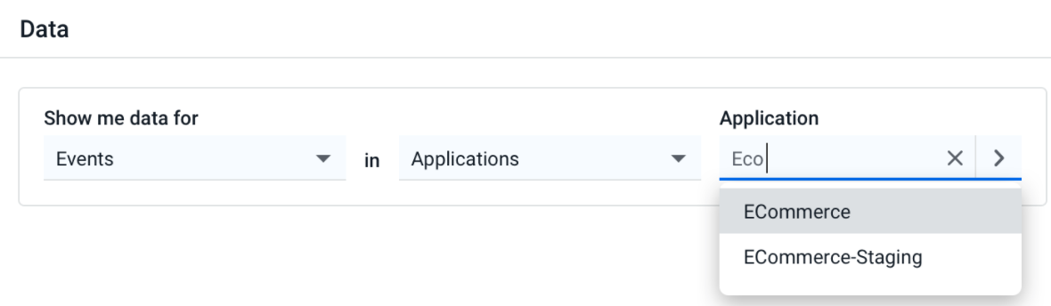
Once you specify valid inputs for all the required fields, the widget is updated on the canvas and displays these results:

Click the Filter Panel icon on the top-right corner of the Datagrid widget to see the available filters to apply.
To view information such as summary, details, actions executed, and comments about the selected event, double-click the specific row of the widget. Based on your analysis of the event information, you can start a war room, delete the event, archive it, or test the action.
You can also resize the widget in vertical and horizontal directions by dragging the edges.
Label Widget
A Label Widget is a simple text string that enables you to add text on the dashboard canvas.
Widget Properties
You can select these options under the Widget Properties panel to modify the appearance of the Label widget:
| Property | Description |
|---|---|
| Background Color | Set the background color of the widget. You can either leave the the default option as it is or customize it. |
| Padding | Add extra spaces between top and bottom of the text within the widget. The default value is 1. |
| Border | Set the border around the widget. |
| Shadow | Set a shadow around the widget. |
| Property | Description |
|---|---|
| Font Color | Specify the color of the text inside the widget. |
| Font Size | Specify the size of the text within the widget. |
| Horizontal Alignment | Define horizontal alignment of the text in the widget. |
| Vertical Alignment | Define vertical alignment of the text in the widget. |
See single click action.
Image Widget
You can use the Image Widget to add images to a new dashboard.

Widget Properties
You can select these options under the Widget Properties panel to modify the appearance of the Image widget:
| Property | Description |
|---|---|
| Background Color | Set the background color of the widget. You can either leave the the default option as it is or customize it. |
| Padding | Add extra spaces between top and bottom of the text within the widget. The default value is 1. |
| Border | Set the border around the widget. |
| Shadow | Set a shadow around the widget. |
| Property | Description |
|---|---|
| Image Scale | Set the image size. You can select one of the following options:
|