Download PDF
Download page Flow Maps.
Flow Maps
This page describes how to view and use flow maps.
Flow maps present a dynamic visual representation of the components and activities of your monitored application environment. See Overview of Application Monitoring.
Flow Map Overview
Flow maps show the tiers, nodes, message queues, and databases in the environment, and the business transactions that flow through them. This sample shows a basic flow map for an e-commerce application. In the sample, several application server tiers interact with databases, remote services, an Apache message broker, and an IIB node making calls to itself.
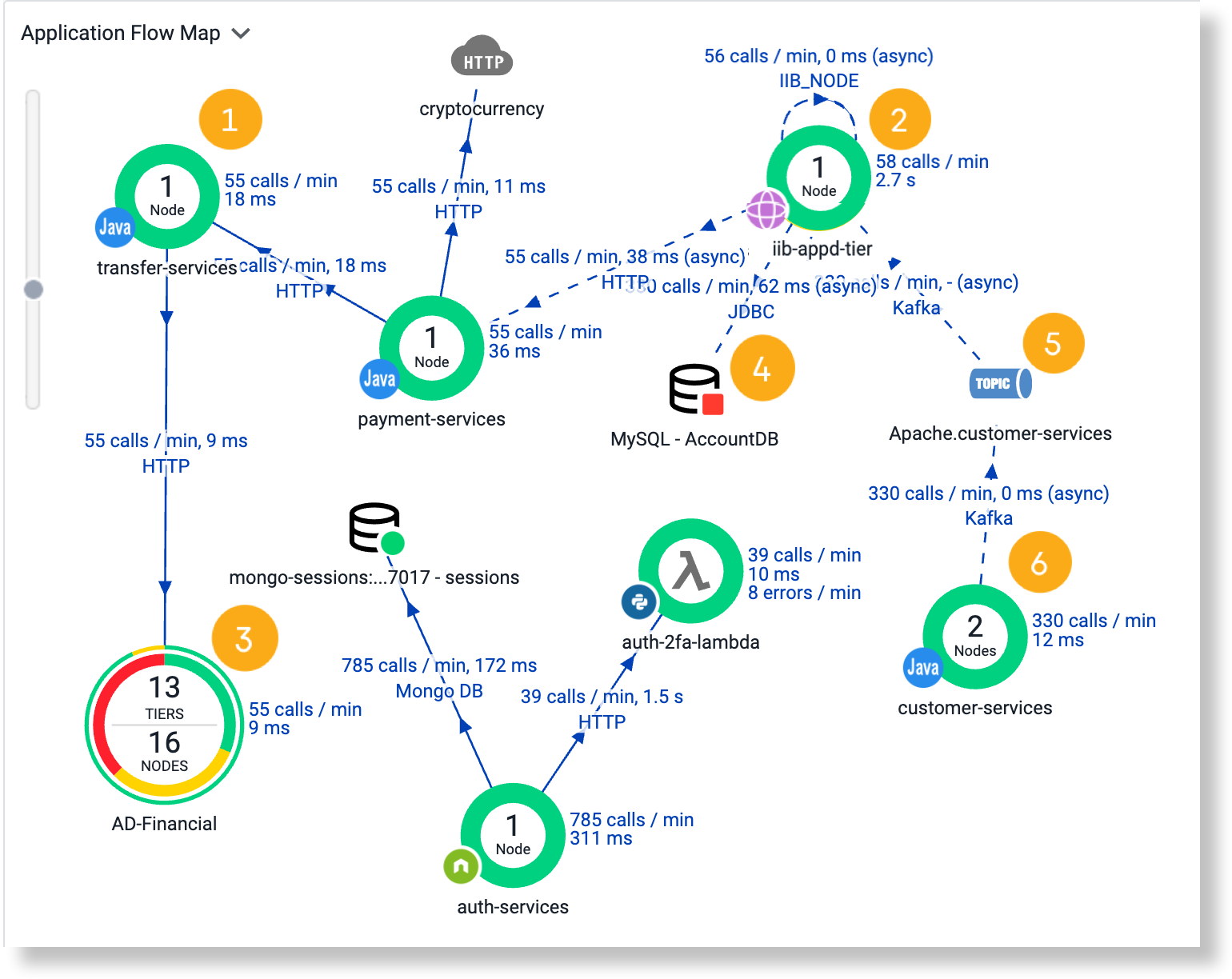
![]() Application server tier with a single node
Application server tier with a single node
![]() Endpoint call to a different endpoint in the same IIB service
Endpoint call to a different endpoint in the same IIB service
![]() Downstream business application: the inner ring depicts node health and the outer ring depicts Business Transaction (BT) health
Downstream business application: the inner ring depicts node health and the outer ring depicts Business Transaction (BT) health
![]() MySQL database service
MySQL database service
![]() Apache messaging service
Apache messaging service
![]() Application server tier with two nodes
Application server tier with two nodes
Connection Types
Flow lines represent connections between components in the flow map. Solid lines indicate synchronous connections. Dashed lines indicate asynchronous connections.
Many modern frameworks use asynchronous patterns even if you do not explicitly call an asynchronous function or method. For example, your application code may employ a synchronous call to a framework or an Object-relational mapping style API, but the framework itself invokes an asynchronous executor to handle the call. These types of asynchronous segments show up as a dotted line on the flow map. See Trace Multithreaded Transactions for Java or Asynchronous Exit Points for .NET.
Request Times
The numbers above the flow lines indicate the calls made per minute to the tier and the average time taken for the request to be serviced; that is, the round-trip time for the request. The round-trip time includes time spent on the network, if applicable to your topology, and the time that the backend server or other process spends processing the request. The calls per minute for a given context, such as a tier, must be one or more for the flow map to display.
Performance Baselines
AppDynamics automatically calculates the baseline performance for your applications. Once the Controller Tenant establishes prevailing performance characteristics, it can detect anomalous conditions for your application. It calculates baselines by using the underlying hourly data.
The default view for the flow map is set to Don't compare against baseline. You can set the flow map to compare against pre-configured or custom baselines using the Baseline menu.
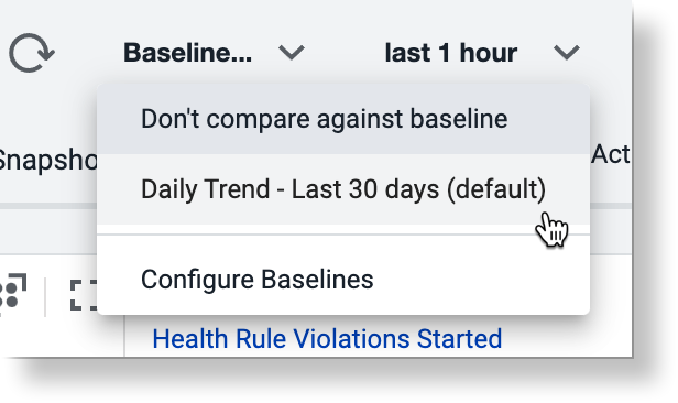
If performance baselines are set for transactions represented in the flow map, the flow lines use a corresponding color to indicate the performance of the service relative to the baseline.
- Green indicates that response times are within range of the baseline.
- Yellow indicates that response times are slower than the baseline.
- Red indicates that response times are critically slow. It can take some time for the Controller Tenant to establish baselines for a new installation.
Click Legend to learn more about how flow maps represent data with respect to baselines.
Live Entity Data
By default, the flow map only shows the nodes receiving performance data. This optimizes rendering and enables a quick view of the active nodes. You can set a filter to view the nodes not receiving performance data to help you troubleshoot node issues.
When an entity is alive, it will affect other associated entities:
- When a business transaction entity is alive, the associated node, tier, and application will be alive.
- When a node is alive, the associated tier and application will be alive.
- When a tier is alive, the associated application will be alive.
If the Controller Tenant detects that a flow map is taking a long time to load, it does not load the flow map automatically. Click Show Flow Map to display it.
Types of Flow Maps
These flow maps appear in several of the built-in dashboards depicting different information according to the data context:
- Cross-Application—displays exit calls between applications within the monitored environment. This pattern of calls is known as cross-application flow.
- Application—displays the topology and activities within an application. It displays metric values across all business transactions in the application for the selected time range.
- For example, the application flow map displays calls per minute; average response time for calls made to databases and remote services; and business transaction errors per minute. These metrics are based on all calls made from a specific tier to a database or remote service across all business transactions.
- When an application is one of several in a one-app-per-service architecture, business transactions can represent service endpoints. For these applications, the flow map displays a Cross-BT Hovercard that shows calls to upstream and downstream business transactions which represent endpoints of other services.
- Tier and Node—displays metric values across all business transactions for the subset of the application flow related to the selected tier or node.
- Business Transaction—displays the activity for a BT. The Start label indicates the tier where the transaction starts (the originating tier). This flow map shows metrics that are calculated based on all executions of the BT during the selected time range.
Snapshot—displays the metrics associated with a single snapshot specific to a particular execution of the transaction.
AppDynamics shows cross-application flow in other flow maps where appropriate. For example, a tier flow map shows correlation when there are exit calls from the tier to another instrumented application.
Context can determine the meaning of what flow maps represent. Consider the average response time (ART) for calls to a database.
- In the context of an application, ART averages all calls to the database occurring within the application. Suppose that the application flow map shows that ART for those calls is 20 milliseconds.
- In the context of a BT, ART represents the average execution time for the BT as a whole. Suppose that in a BT within the same application, the database gets called twice each time the BT executes. In the BT flow map, ART represents the average duration of a pair of database calls, meaning that ART is 40 milliseconds.
Flow Map Interactions
On flow maps you can:
- Click once on an object to see key performance indicators in an informational popup.
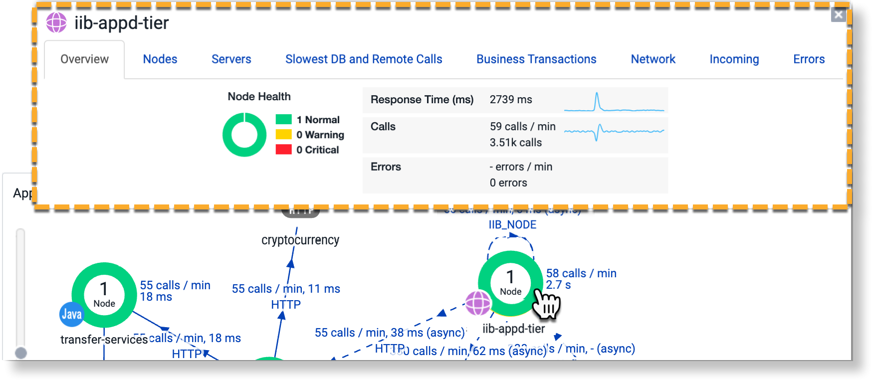
- Double click an object to open a detailed flow map of that object.
Change the Time Range setting to have the flow map represent the activity of the system within the selected time frame.

The flow maps show a maximum of the last 60 minutes of data, even if the time range in the UI is set to a greater range. This only applies to flow maps; the data in other graphs on the dashboard represent the selected time range.
Click and drag objects to rearrange the flow map layout.
Use the view and arrangement options at the top right to view as a list, auto-arrange for the fewest crossing flows, or maximize the view.
The Cross-BT Hovercard in the Application Flow Map
For an application in a one-app-per-service architecture, the application flow map displays a Cross-BT Hovercard showing calls from upstream and downstream business transactions representing endpoints of other services.
This enables you to isolate the service which is the origin of any problem that arises, to one of three possibilities:
- The service whose endpoint is a BT that you are monitoring (your service).
- An upstream or downstream service, that your service communicates with through cross-BT calls.
- Yet another upstream or downstream service, that your service communicates with indirectly through a chain of cross-BT calls between several services.
To access the Cross-BT Hovercard, select the line representing either the incoming or outgoing cross-application call, and then select the Business Transactions tab.
Manage Flow Maps
In a large-scale deployment, the flow map may show hundreds of monitored nodes. You can create custom flow maps that target specific areas of interest.
You can configure it to show only certain tiers or those based on performance thresholds, for example:
- Only show tiers from where the load exceeds fifty calls per minute and the average response time exceed 10,000 ms.
- Only show backends receiving at least 400 calls per minute and generating more than 10 errors per minute.
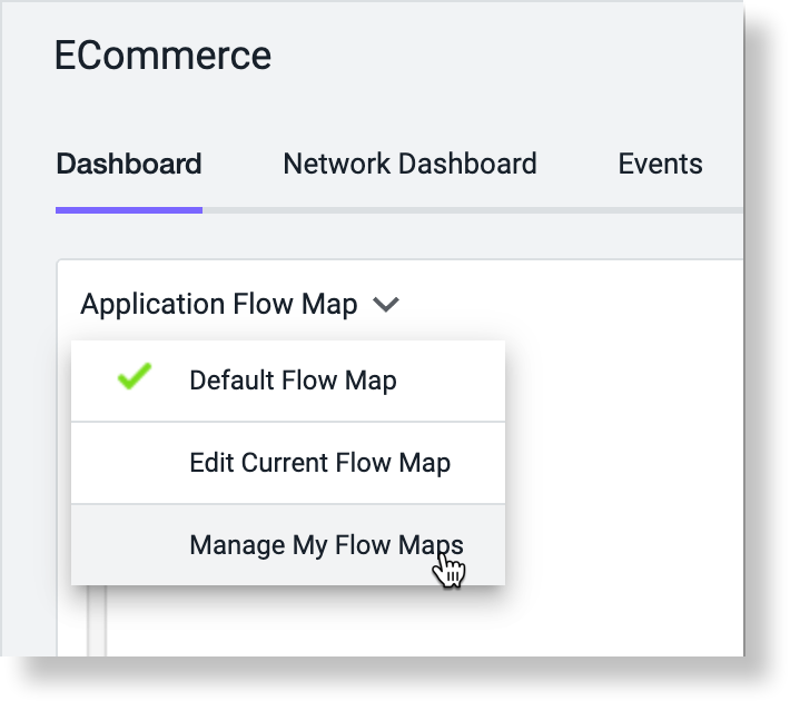
To create, copy, or delete a flow map, click Manage My Flow Maps in the flow map menu.
When you create a flow map, the new flow map inherits the context of the flow map in which it was created, whether created from an application, business transaction, tier, or node flow map. See 2022-09-30_16-59-57_Customize Flow Maps.