Download PDF
Download page Metric Data Resolution over Time.
Metric Data Resolution over Time
You can view metrics in the Controller for different time intervals or resolutions.
Metric Generation and Time Zone Differences
In a distributed system, the metrics that the Controller collects may come from different time zones.
Before sending metrics to the Controller, agents normalize the times associated with the metrics by applying a UTC (Coordinated Universal Time) offset appropriate to their region.
In the Controller UI, all times display in the Controller user's local time. To render local times, the UI applies the offset needed to render UTC time into the user's time zone as configured on the device on which the browser is running.
While the time zone used in the UI is taken from the local environment and cannot be modified apart from changing the computer's system time, each UI user can adjust the format of the time display, as described in User Preferences.
While the Controller UI displays times in the local system time, specific timestamps generated by AppDynamics reflect the Controller system time. These include, for example, event timestamps in notification messages, which indicate the Controller system time.
SaaS Controllers use Pacific Time (PT) as their system time.
Metrics Data Resolution
Metrics Data Retention and Deletion
Metrics data is retained and deleted according to the following:
- After 8 days, data at 1-minute resolution is deleted.
- After 365 days, data at 1-hour resolution is deleted.
Metrics data is retained and deleted according to the following:
- After 4 hours, data at 1-minute resolution is deleted.
- After 48 hours, data at 10-minute resolution is deleted.
- After 365 days, data at 1-hour resolution is deleted.
View Rolled Up Data in Graphs
Depending on your environment, AppDynamics measures hundreds, thousands, or even tens of thousands of metric values each minute. To display these results over time in a meaningful way, AppDynamics rolls up the data at regular intervals (for example, at one-minute, ten-minute, and one-hour intervals) based on how long ago the metric was measured.
In graphs throughout the Controller UI, you can hover over a point on the chart to get the value of the metric data measured during the interval represented by the point. The point represents the beginning of the interval. The length of the interval depends on the selected time range. Admin-level users can adjust the amount of time data is retained at each resolution, although we do not generally recommend keeping data for longer than these default values. Default settings are listed below.
Rolled Up Data in Graphs
For up to 8 days, data is rolled up every minute and displayed at a minimum of 1-minute resolution. Graphs may display data at intervals of 1, 2, 5, 10, 20, 30, 60, and multiples of 60 (120, 180, 240 and so on) minutes as previously described in Metrics Data Retention. If the granularity is set to one, each point on the graph represents a 1-minute interval; the point represents the beginning of the minute. Therefore, when the granularity is set to one, the data presented for a 5:00 AM point represents the values measured from 5:00 AM to the millisecond before 5:01 AM. If the granularity is set to two, each point on the graph represents a 2-minute interval, and the data displayed for a 5:00 AM point represents the values measured from 5:00 AM to the millisecond before 5:02 AM.
After 8 days, data is rolled up every hour and displayed at a minimum of 1-hour resolution. Graphs may display data at a granularity of 60, and multiples of 60 (120, 180, 240 and so on) minutes as previously described in Metrics Data Retention. If the granularity is set to 60, each point on the graph represents a 1-hour interval; the point represents the beginning of the hour. Therefore, when the granularity is set to 60, the data displayed for a 5:00 AM point represents the values measured from 5:00 AM to the millisecond before 6:00 AM. If the granularity is set to 120, each point on the graph represents a 2-hour interval, and the data displayed for a 5:00 AM point represents the values measured from 5:00 AM to the millisecond before 7:00 AM.
After 365 days, data at 1-hour resolution is deleted.
- For up to 4 hours, data is rolled up every minute and displayed at a minimum of 1-minute resolution. Graphs may display data at intervals of 1, 2, 5, 10, 20, 30, 60, and multiples of 60 (120, 180, 240 and so on) minutes as previously described in Metrics Data Retention. If the granularity is set to one, each point on the graph represents a 1-minute interval; the point represents the beginning of the minute. Therefore, when the granularity is set to one, the data presented for a 5:00 AM point represents the values measured from 5:00 AM to the millisecond before 5:01 AM. If the granularity is set to two, each point on the graph represents a 2-minute interval, and the data displayed for a 5:00 AM point represents the values measured from 5:00 AM to the millisecond before 5:02 AM.
- For up to 48 hours, data is rolled up every 10 minutes and displayed at a minimum of 10-minute resolution. Graphs may display data at intervals of 10 and multiples of 10 (20, 30, 40, and so on) minutes as previously described in Metrics Data Retention. If the granularity is set to 10, each point on the graph represents a 10-minute interval; the point represents the beginning of the minute. Therefore, when the granularity is set to 10, the data displayed for a 5:00 AM point represents the values measured from 5:00 AM to the millisecond before 5:10 AM. If the granularity is set to 20, each point on the graph represents a 20-minute interval, and the data displayed for a 5:00 AM point represents the values measured from 5:00 AM to the millisecond before 5:20 AM.
- After 48 hours, data is rolled up every hour and displayed at a minimum of 1-hour resolution. Graphs may display data at a granularity of 60, and multiples of 60 (120, 180, 240 and so on) minutes as previously described in Metrics Data Retention. If the granularity is set to 60, each point on the graph represents a 1-hour interval; the point represents the beginning of the hour. Therefore, when the granularity is set to 60, the data displayed for a 5:00 AM point represents the values measured from 5:00 AM to the millisecond before 6:00 AM. If the granularity is set to 120, each point on the graph represents a 2-hour interval, and the data displayed for a 5:00 AM point represents the values measured from 5:00 AM to the millisecond before 7:00 AM.
- After 365 days, data at 1-hour resolution is deleted.
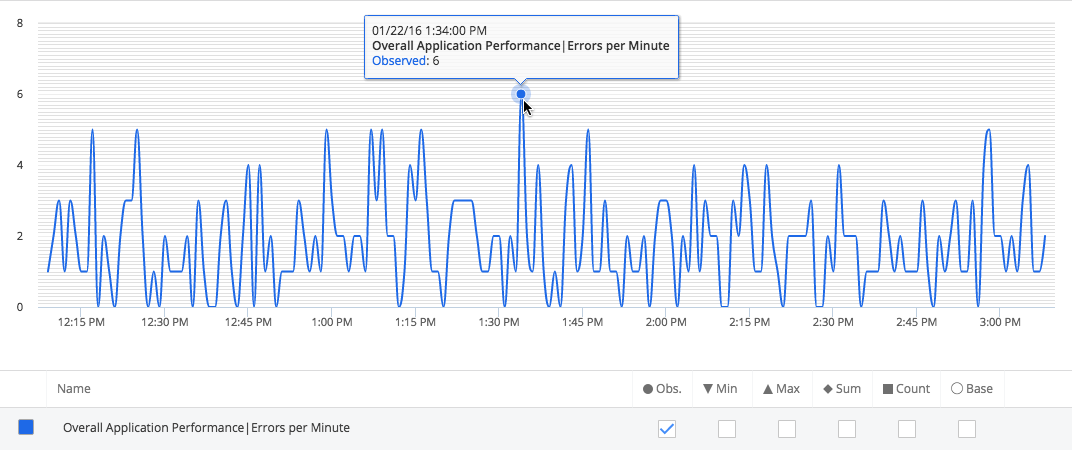
One-Minute Resolution
Each point on the graph represents a roll-up of all the values measured during one minute. For example, if AppDynamics measures the response time for an application for 300 calls in a minute, the response time values of those 300 calls are averaged to present the Average Response Time (ART) for that minute. When you hover over a point on the chart, the Count figure represents how many times the metric data was measured during that minute.
In this graph, response time was measured 140 times between 2:57 and 2:58 PM and the ART for that minute was 889 ms.

In this chart, the time range was set for the last three hours, so the interval is one minute. The errors per minute value displayed at the 1:34 PM point represents the number of errors recorded during the minute from 1:34 PM to the millisecond just before 1:35 PM.
Ten-Minute Resolution
Metric data is displayed at a 10-minute resolution, and each point on the graph represents a roll-up of the values measured during that 10-minute period.
The ART for the rolled-up time period represents the true average. The ART aggregates the sum and count of the total requests for the period; it does not average the ARTs calculated for the previous roll-up granularity.
One-Hour Resolution
Metric data is displayed at a 1-hour resolution, and each point on the graph represents a roll-up of the values measured during that 60-minute period.
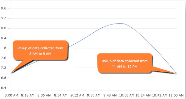
How the Last Interval Displays in a Chart
Because of the way rolled-up data displays, it may appear as if data is not included for the last increment in the time range. However, the last data point represents the last interval in the range.
For example, when you set a time range from 8 AM to 12 PM for a day that has been rolled up into 1-hour data points, you might expect to see five data points, one for 8 AM, 9 AM, 10 AM, 11 AM, and 12 PM. However, the returned data consists of four data points for the hours 8 AM, 9 AM, 10 AM, and 11 AM. The first data point, 8:00 AM, represents data collected from 8 AM to the millisecond just before 9 AM. The last data point, 11:00 AM, represents data collected from 11 AM to the millisecond just before 12 PM. So you are actually seeing data from 8 AM to 12 PM, even though the last data point in the graph is 11 AM.
View Charts for Long Time Ranges
For time ranges that are greater than three weeks, graphs in the UI such as the Slow Transaction graph show the 14th of each month as the time point on the x-axis. For a time range that is less than two full months, this means that the graph may only have a single point, the middle of the month encompassed by the time range.
View Details about Older Data
To review details for an issue that occurred during a period for which you have only 10-minute or 1-hour data, AppDynamics provides access to diagnostic data through Transaction Snapshots. For example, suppose you were seeing values for 2 AM and 3 AM three days ago, but you need to examine details about a problem you were alerted about that occurred at 2:15 AM that morning. You view Transaction Snapshots for the hour between 2 AM and 3 AM to see details about what happened during that time period. By default, snapshots are retained for two weeks, and individual snapshots can be archived. See Transaction Snapshots.
If you are viewing a graph in the Metric Browser, you can select a specific period in the chart and drill down to see Transaction Snapshots and other information. See Analyzing Performance for a Specific Time Range.