Download PDF
Download page Tier Metric Correlator.
Tier Metric Correlator
The Tier Metric Correlator enables you to identify load and performance anomalies across all nodes in a tier. Suppose you have a tier composed of a cluster of nodes running on containers or servers. You expect all the nodes to behave exactly the same under the same load conditions. How can you monitor this cluster for anomalies and outliers? You can use the Tier Metric Correlator to answer the following questions:
- Are all the nodes behaving within the expected band of performance, or do some nodes have outliers (slow calls, stalls, and errors)?
- In what time windows, and on which nodes, are these outliers occurring?
- Are outliers associated with a specific node cluster—for example, a cluster running a canary release?
- Are any resource issues (such as high CPU I/O or paging) correlated with these outliers?
- Are calls getting distributed evenly across all nodes in the tier?
This page describes two example use cases:
- Use Tier Metric Correlation to quickly identify balances and imbalances in the distribution of calls across all nodes in a tier.
- Use Tier Metric Correlation to monitor and troubleshoot a canary deployment scenario. This example shows how you can easily compare performance across node clusters, identify nodes with transaction outliers, and determine if any resource issues are causing these outliers.
Key Concepts
Transaction Outliers
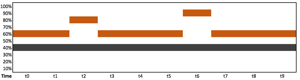
The first step in metric correlation is to determine the transaction outliers for a tier: the number of Slow Calls, Very Slow Calls, and Stalled Calls whose response times are significantly outside the norm for that tier. The Transaction Outliers Heatmap visualizes the rate of these outliers and their distribution across all nodes in the tier.
A heatmap is a time-series chart with an extra dimension: the color intensity of each bar shows the distribution of outliers across all nodes. The darker the hue, the more nodes have outliers. The chart colors the bars in shades of gray (fewer outliers) and orange (more outliers).

Heatmaps enable you to easily identify the normal bands of performance and any outliers for all nodes in a tier. In this example, all nodes fall within two bands:

This heatmap highlights two time windows where the performance metric is noticeably higher for 50% of the nodes:
Correlated Metrics
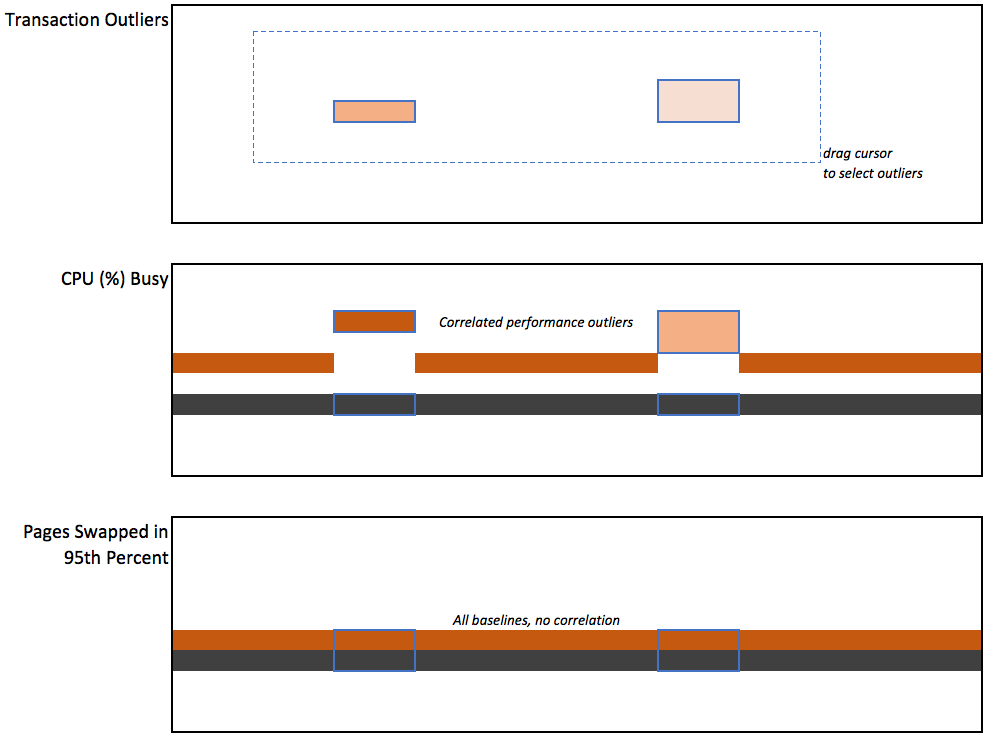
The Correlated Metrics heatmaps enable you to correlate transaction outliers with specific resource metrics. The Correlate Metrics panel enables you to easily identify performance metrics that correlate (and do not correlate) with transaction outliers of interest. This example shows three heatmaps:
- Transaction outliers
- Correlated metric
- Uncorrelated metric (no outliers)
Troubleshooting Nodes and Servers
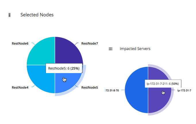
When you select a set of transaction outliers, the Selected Nodes and Impacted Servers charts show the distribution of these outliers across all nodes in the tier. This makes it easy to determine if these outliers are associated with specific node clusters. Double-click a pie chart to troubleshoot the node or server.
Example Use Cases
Comparing Load Distributions
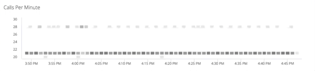
In this example, a DevOps engineer wants to ensure that transaction calls are getting distributed evenly to all the nodes in a tier. The engineer accesses the Tiers & Nodes view, right-clicks a tier, and selects Correlate Metrics. Looking at the Calls Per Minute heatmap, the engineer can immediately see that the band of performance is 20-22 calls per minute, but for some nodes, the rate is higher during certain intervals. The engineer decides to investigate the relevant load balancer and finds that a simple misconfiguration is causing the device to distribute calls unevenly at certain times. Using heatmaps, they can identify and fix a minor issue before it has a significant impact on their team's mission-critical applications.
Canary Deployment Testing
A DevOps engineer is responsible for a four-tier e-commerce application. The Order-Tier has five nodes running version 1.0 of the service. The engineer deploys a "canary" (version 1.1 of the service) on one node. Before the engineer deploys 1.1 on all nodes, they want to determine if there is any performance degradation on this node.
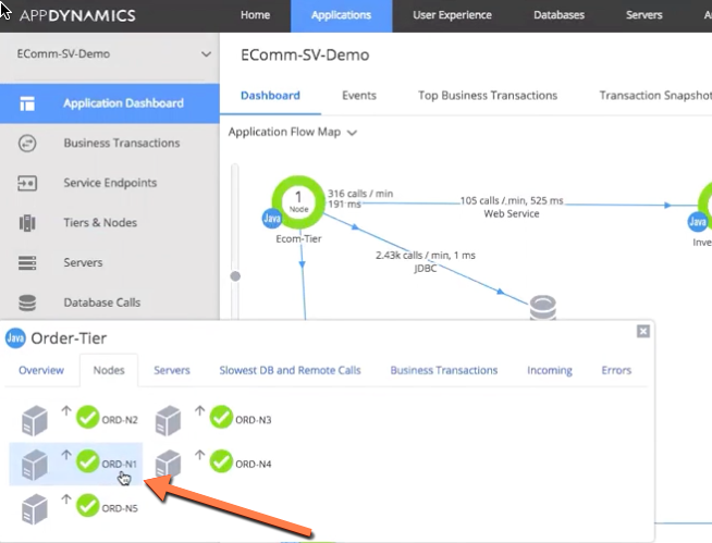
The engineer opens the Controller, accesses the Tiers & Nodes view for the application of interest, right-clicks the Order-Tier, and selects Correlate Metrics. The Tier Metric Correlator displays.
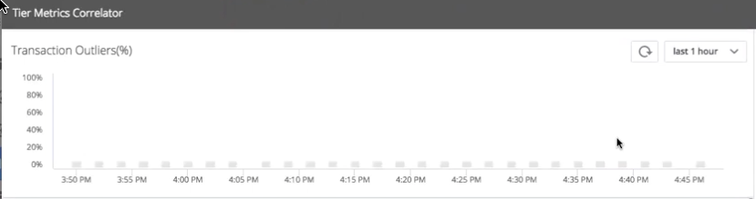
The Transaction Outliers heatmap shows that some calls are outliers: Errors, Slow Calls, Very Slow Calls, or Stalled Calls whose response times are significantly higher than the band of performance for that tier.
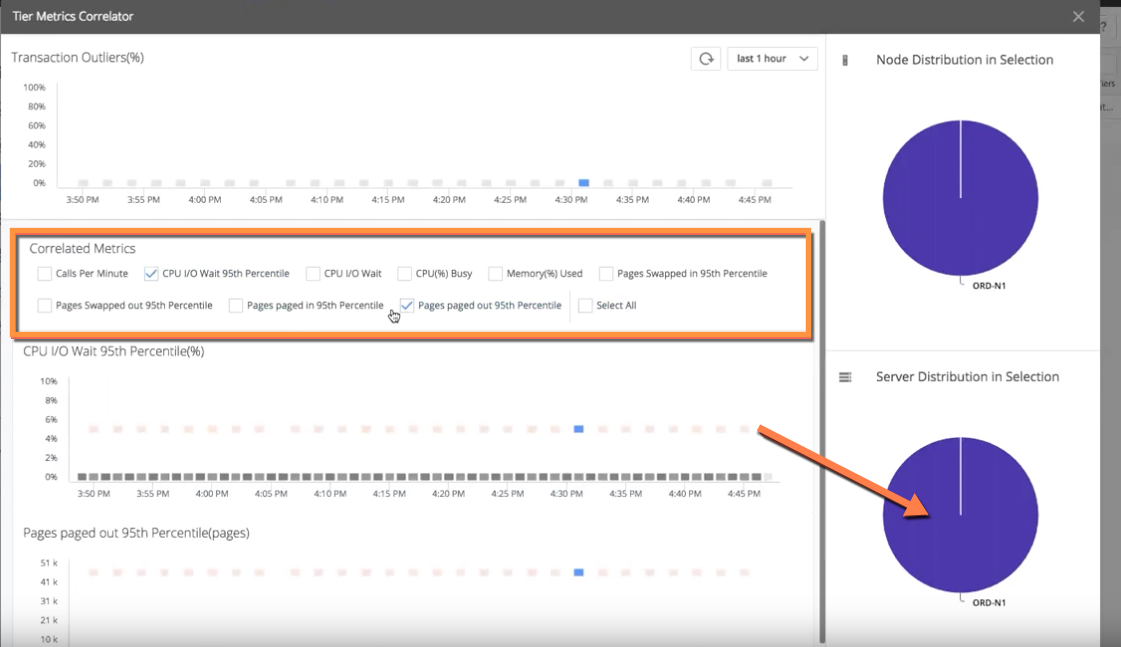
The first question is: Are these outliers associated with our "canary node" (ORD-N1)? The engineer drag-selects a set of these outliers. The Node Distribution in Selection pie chart (right) shows that all outliers are associated with the canary node. Clearly, the new code is not performing as well as the old code.

The next question is: Are any resource issues causing these outliers? The engineer examines the Correlated Metrics heatmaps to look for metrics that correlate with the outliers on the canary node. Most heatmaps show no correlation. For example, CPU Busy% shows that all nodes stay within the band of performance of 0-20%.

However, the CPU I/O Wait 95th Percentile(%) heatmap shows a strong correlation: All the metric outliers occur on the canary node, while all other nodes remain within the band of performance.

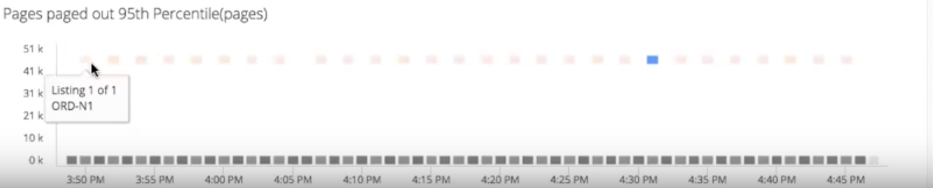
The Pages paged out 95th Percentile (pages) heatmap also shows a strong correlation with the transaction outliers on the canary node. With just a few clicks, they can immediately see that the canary node is performing worse; that the node has a CPU I/O problem; and that the CPU I/O problem is related to paging, which indicates a disk problem.
To reduce the visual noise and highlight the correlations, the engineer unchecks all the uncorrelated metrics. The next step is to investigate and troubleshoot the underlying server. To drill down into the canary node, they double-click on the Server Distribution in Selection pie chart (bottom right).
The Server Dashboard for the canary node displays. The engineer selects the Volumes tab and sees many spikes in I/O operations and queue wait times. They decide that the canary code is not ready to deploy to the entire tier, and need to re-examine the canary code, fix the regression, and re-test.

Enabling Tier Metric Correlation
You enable Tier Metric Correlation per account on the Controller.
If you are using a SaaS Controller, contact AppDynamics Support.
If you are using an on-premises Controller:
- Log in to the Controller administration console using the
rootuser password:http://<controller host>:<port>/controller/admin.jsp - Access the Accounts page, and select the account for which you want to enable this feature.
- Select Add Property in the accounting settings and add:
ENABLE_SIM_HEATMAPS= true
To correlate percentile metrics, you must enable percentile metric reporting on both the Controller and the Machine Agent. By default, reporting is disabled on the Controller and enabled on the Agent.
- To enable/disable reporting on the Controller, log in to the Controller administration console and set the
sim.machines.percentile.percentileMonitoringAllowedproperty. See Controller Settings for Machine Agents - To enable/disable reporting on the Agent, open the
<machine_agent_home>/extensions/ServerMonitoring/conf/ServerMonitoring.ymlfile and set thepercentileEnabledproperty. See Machine Agent Settings for Server Visibility
Workflow Description
These steps outline the workflow description:
Access the Tiers & Nodes view for the application of interest.
- Right-click the tier and select Correlate Metrics. The Tier Metric Correlator displays.
- Identify transaction outliers
 for the tier – calls flagged as Slow, Very Slow, Stalls, or Errors (see Business Transaction Performance).
 - Drag the cursor to select the outliers of interest. The pie charts on the right show the distribution of these outliers by node and server.
- Identify any correlated metrics
 for the outliers. Unselect checkboxes for non-correlated metrics
  .
. - Identify and troubleshoot the nodes
 and servers
  where the outliers are occurring. Double-click a pie slice to open the dashboard view. You can use the correlated metrics to guide your troubleshooting.
