Download PDF
Download page Monitor Applications with the IoT Dashboards.
Monitor Applications with the IoT Dashboards
IoT Monitoring provides you with three dashboards to view and analyze the performance and usage of your application. Each dashboard provides you with a different aspect of your application's performance. Within each dashboard, you can view data visualized as widgets or detailed records or create custom widgets based on your chosen parameters.
The page introduces the features, functionality, and goal of each of these dashboards:
Device Dashboard
The Device Dashboard enables you to monitor your device status, custom information, and custom device application information. You can view summary activity or use filters to drill down to view metrics for a specific device.
Using the Device Dashboard, DevOps can ensure that devices are up and running, product managers and business stakeholders can examine device activity and trends, and developers can drill down into results to identify issues affecting single or multiple devices.

Network Request Dashboard
The Network Request Dashboard enables you to view outgoing network requests, network request details, and analyze network requests.

With the Network Requests Dashboard, you can:
Check the availability of a device or service
Discover slow network requests
View failed network requests
Analyze and sort network requests by criteria such as status code, app version, and so on
Monitor network traffic over time
Error Dashboard
The Error Dashboard enables you to view crashes, exceptions, and custom errors, both fatal and non-fatal. DevOps can monitor activity list and notify developers of error events. The developers can select the error event to view details and download the stack trace for debugging.

The stack trace will only be available if it is reported with the IoT SDKs or through the IoT REST API.
With the Error Dashboard, you can:
Discover new errors
Assess the scope and impact of errors, such as how many devices are affected, what type of devices are affected, and how seriously affected are the devices.
Monitor error patterns
Download stack traces of errors to debug code
Discover broken devices (failed hardware)
How to Use IoT Dashboards
Although each dashboard presents different information, they all have the same UI functionality and features. This page provides an overview of the dashboard functionality to help you get started monitoring your devices.
Access the IoT Dashboards
- Open the application you want.
- Select one of the dashboards to view:
- Devices
- Network Requests
- Errors
View Dashboard Summaries
From each dashboard, you can view aggregated data in predefined and custom widgets. Each dashboard is in view mode by default, so data is read-only, although you can set filters, view details, and resize widgets.

View Details
To view details, you select a row in one of the tables and click the Details icon. The Device Details dialog displays. You can view when the three types of events (Custom Event, Network Request, and Error) occurred on the timeline, or by duration. You can also click on the event bar in the waterfall for more details.

Filter Results
You can filter results by adding criteria. This enables you to focus on factors affecting availability, usage, and performance.
In this screenshot, the criteria softwareversion and Country are added, which could potentially home in on performance issues caused by a particular software version in a particular country.

Modify Content and Presentation
To modify the dashboard, you need to be in Edit mode. You simply change the toggle to Edit, and then you'll be able to add, move, resize, remove, and even create widgets.

Build Custom Dashboard Widgets
Each dashboard has predefined widgets for basic monitoring, but because there are so many different devices and platforms, you will need to create custom widgets with the Widget Builder, which guides you through the creation of a widget. This page provides guidance for selecting graph types and using filters when you create widgets.

How to Access the Widget Builder
- Select a dashboard.
- Change to Edit mode.
- From the toolbar, click Add Widget.
- From the dropdown, click Create a Widget.
Choose the Best Graph Type
The Widget Builder allows you to choose from one of six types of graphs, you should try to use the best graph for your data set. The following is a guideline for choosing the graph type:
| Graph Type | Graph Properties | Use Case(s) |
|---|---|---|
| Pie Chart |
| Use pie charts to compare parts of a whole. Examples:
|
| Bar Chart |
| Use bar charts to compare different items within the same category. Examples:
|
| Time Series |
| Use a time series to measure events over time. Examples:
|
| Histogram |
| Use histograms to analyze and understand the distribution of large sets of numerical data. Examples:
|
| Number |
| Use a number graph to highlight an important data point. Examples:
|
| Table |
| Use a table to view detailed data for a list of similar items. Examples:
|
| Geo |
| Use the Geo widget to analyze and understand performance across geographic areas. Examples:
|
How to Use Filters
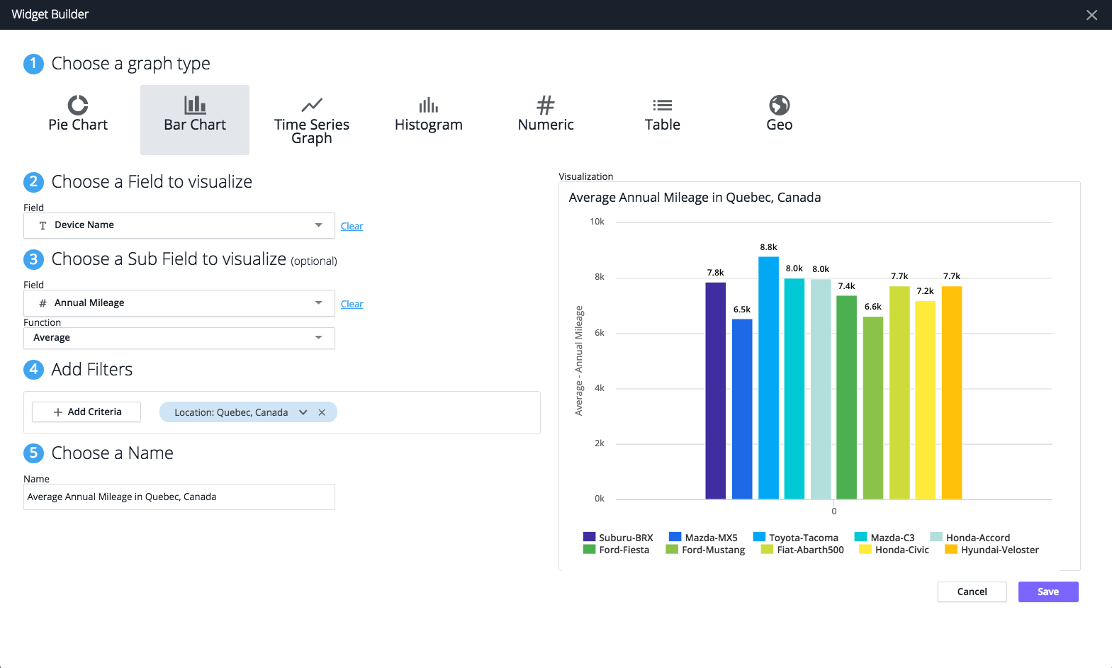
Filters enable you to narrow your results to meaningful information. For example, suppose you wanted to see the total number of items sold at each store, but you were particularly interested in those more expensive items. You could choose a bar graph and use the field Device Name and the subfield Annual Mileage with the filter Location: Quebec, Canada to view the average annual mileage of cars in Quebec, Canada, as shown in the example widget: